
When a program veers off track, my immediate reflex is to look at the data, specifically through custom charts designed to expose the actual bottleneck. Standard corporate reporting doesn’t always show the problem. By building a visualization tailored to a specific problem, you instantly shift the room from a heated argument about opinions to a calm conversation about facts.
I was working with a major software enterprise with a large salesforce selling to businesses. The sales organization decided to implement new sales incentives designed to maintain negotiated prices. These incentives were expected to increase dollar sales by $100 million per year before any unit sales increases. This benefit was eagerly anticipated, so keeping the project on schedule was a high priority. In fact, it was the reason I was hired.
How the team unknowingly over-committed
Unfortunately, I found a problem almost as soon as I joined. The enterprise ran agile SAFe processes barely modified from waterfall. Program Increment (PI) planning operated like a traditional design phase: typically, every single story was written, sized, and scheduled in the PI sprints. Sprints were strictly for building and internal testing, followed by a lengthy, formal QA period.
The key scrum team on this program had quietly made a large over-commitment, driven by three underlying issues:
- Unsized Scope: Several stories skipped sizing during PI planning, making the backlog look deceptively small.
- Scope Creep: Confident in that seeming over-capacity, IT signed up for extra features requested by the business.
- Lagging Velocity: The team was delivering at a slower pace than the initial plan assumed.
It was a perfect storm, but when I stepped in, only the velocity problem was visible.
Tracking down the real numbers
Right after IT agreed to the new scope, my initial audit caught the unsized stories. In response, the Scrum Master had the team start sizing the remaining backlog, while I built a capacity spreadsheet to get hard data on the situation. I mapped out capacity points per sprint using historical velocity, factoring in holidays and planned leave to keep the forecast grounded in reality.
Against the newly fully-sized backlog, the data was brutal: we needed nine sprints to deliver, not the planned six. An extra three sprints would have completely wiped out our formal testing window, making a delayed release inevitable.
| Velocity | Commitment | 1 | 2 | 3 | 4 | 5 | 6 | 7 | 8 | 9 | Total |
|---|---|---|---|---|---|---|---|---|---|---|---|
| Planned | 300 | 50 | 50 | 50 | 50 | 50 | 50 | n/a | n/a | n/a | 300 |
| Actual | 380 | 42 | 47 | 46 | 45 | 45 | 45 | 45 | 45 | 20 | 380 |
That gave me the scale of the crisis, but not the root cause of the velocity issue. To find that, I needed to see how the work was actually flowing.
Scope wasn’t entirely static, even given the SAFe approach. Beyond the official feature additions, developers kept uncovering unexpected, routine complexities once they got into the codebase. Standard burndown charts handle this poorly; scope growth and slow progress look identical. A flat line that refuses to drop.
Instead, I built a cumulative burn-up chart tracking points by workflow state day by day. A burn-up separates these variables cleanly: total scope sits on the top edge, while completed work climbs from the bottom. If scope grows, the top line steps up visibly without masking the team’s actual progress underneath.
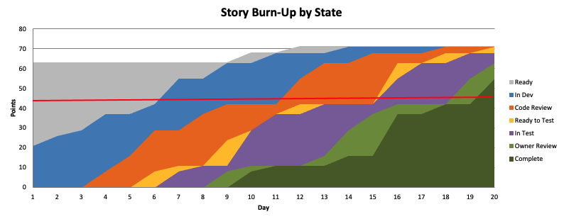
Reading the chart vertically showed the work in progress at any moment; reading horizontally showed the cycle time. The top edge spiked from 63 to 71 points in the first few days—clear visual proof of discovered scope. But the real shock was further down the pipeline: stories were spending four days stuck in code review. Code review was supposed to be a quick final sanity check, yet stories were sitting there for days, which is a long time in a 10-day sprint. When I asked the team why, the issue became clear. Developers were surreptitiously being pulled into other competing projects. Stretched thin, the Dev Lead had started treating code reviews as his lowest priority. This delayed QA, who couldn’t touch the code until the reviews cleared.
How we turned it around
We immediately restructured our priorities, focusing on tester throughput. I worked with development managers to keep the team focused on the program’s work. Code reviews became the Dev Lead’s top priority, even before his own development, to make code reviews turn over quickly. And the developers pivoted to prioritize bug fixes over net-new coding. We also brought on one additional tester, and extended sprinting just one sprint into the testing period, a massive improvement over the disastrous three-sprint delay originally projected.
| Velocity | Commitment | 1 | 2 | 3 | 4 | 5 | 6 | 7 | 8 | 9 | Total |
|---|---|---|---|---|---|---|---|---|---|---|---|
| Planned | 300 | 50 | 50 | 50 | 50 | 50 | 50 | n/a | n/a | n/a | 300 |
| Actual | 380 | 42 | 47 | 46 | 45 | 45 | 45 | 45 | 45 | 20 | 380 |
| Revised | 380 | 44 | 46 | 45 | 56 | 61 | 63 | 65 | n/a | n/a | 380 |
The revised forecast successfully closed the gap. By diagnosing the true bottleneck, the team delivered the full committed scope on the original release date, delivering the benefit to the business. Neither tool I used was overly complex, but they were custom-fit to the problem and provided clear data and insight into the situation.
Note: the diagrams in this post were recreated for illustration and were not pulled from real client data.