
The first post in this series described a capacity planner and burn-up chart that exposed overcommitment. The broader lesson was simple: tracking alone does not make a program visible. A useful plan must show how work moves through teams and time.
The Delivery Challenge
That problem surfaced again during a rewrite of the credit card pages for a large ecommerce site. The schedule was compressed with a hard deadline, with tens of millions of dollars in direct expense if we missed. So issues, delays, and weak handoffs would become expensive quickly. We needed more than a list of remaining work. We needed a reliable view of how each feature moved through delivery and whether the program was keeping pace with the plan.
Each story began as a high-level functional requirement and then moved through UI design, story writing, and story preparation. Development required a sequence of platform teams: desktop backend, desktop middleware, desktop front end, mobile web front end, native app middleware, and the iOS and Android application teams. In total, ten teams contributed to the pipeline, and each depended on the preceding team to complete its work.
Development and testing occurred within the same sprint. The main management risk was therefore not the sprint model itself, but the quality and timing of the handoffs between teams.
Building the Iteration Plan
A conventional status report could show what each team had completed, but it could not show the delivery flow. I built an iteration plan with sprints across the columns and the ten teams down the rows. My goal was to keep sight of how the current work fit into the larger plan, so I could quickly understand the impact of any issues that arose.
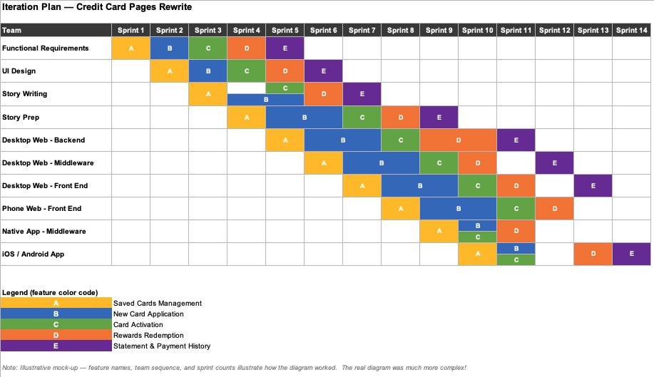
Read vertically, the plan showed the current work in all the teams. Read horizontally, it showed each team’s work from sprint to sprint. Every entry was color-coded by feature, allowing one color to trace a feature’s diagonal path through the teams until release.
This view made dependencies, gaps, and sequencing problems visible in one place. It also gave leaders a program-level view without obscuring the work of individual teams.
The diagram above is a mock-up I created for this post. The actual document was in a Confluence table for easy sharing, and was much more complex.
Managing the Integration Dependency
A second problem appeared after our system was delivered. The rewrite depended on delivery of software from a banking partner, followed by an eight-week integration test. The partner used a waterfall delivery model, so integration testing could not begin until its software was complete. Once again, we needed to stay on our schedule, and going over the eight-week window meant missing our hard deadline. We needed to track testing closely.
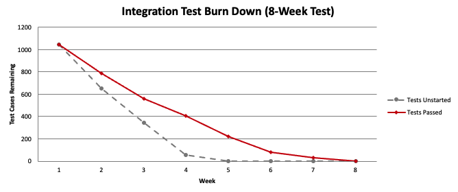
A burn-down chart was the most useful tool for this phase. It showed the partner’s delivery delay, the period when our testing could not proceed, and the rate at which the team recovered once testing began. However, instead of burn-downs for individual sprints, we showed the burn-down for the entire eight-week test period. Stakeholders could see the status of the eight-week integration window without relying on a weekly narrative to explain the variance.
What the Tools Made Visible
Neither tool was technically complex, but each gave me the tools to keep a tight watch on progress and issues. The iteration plan was a grid, and the burn-down chart was a line. Their value came from exposing the causes behind the schedule: a feature moving through ten dependent teams, and a vendor deliverable sitting on the critical path of an integration test.